My Accessibility Review Checklist
Hi there, some of you already know I have an interest in accessibility and contribute to open source projects in this domain. I wanted to write a checklist to remind myself of things to check when I’m reviewing a PR to avoid forgetting elements. This is from my point of view and I’m still learning a lot about accessibility. This might be useful if you want to do so too. I will also link to other checklists because many things already exist before I write this article and they are awesome.
If you have doubts for anything, you can check in the documentation:
Web Content Accessibility Guidelines (WCAG)
TL;DR
Here you have the summary of the checklist to care about:
The detailed checklist
Accessibility checker tools
Testing is the most important part. Even if you are not aware of everything in accessibility, you will know what is wrong and what you have actually done and start to improve somewhere.
You have many tools which can allow you to test your code properly and give you some hints on the rule and/or the code possible to change.
There are many ways to test a website. First we have the accessibility tool checker. You can have it via a browser extension, via the direct website or run it as an integrated tool in your project.
Don’t forget that you can also use the developer tool with some checks related to accessibility. For example, you can force theme colors to see the changes. Personally, I use the browser extension Accessibility Insights. It suits my needs most of the time and it’s a very complete tool.
To avoid reinventing the wheel, I suggest you learn more on how to start accessibility testing via the article done by a11y.coffee.
If you would like to automate some tests, this is also something possible.
“57.38% of total Issues were detected during automated tests” according to Deque, you can find more information on the website.
Pa11y is a great tool to automate your accessibility testing, you have the Pa11y CI which is built to run under continuous integration. You can find many tutorials on Pa11y on their website.
HTML markup
This is something we don’t frequently think about but this does impact the accessibility. Div and span are tags without semantic meaning and this is really important. Semantic elements are recognized by browsers but also by screen readers and other assistive technologies. I think I can’t write better about how it is important than Semantic Code. Why meaning is important from accessibiltywise.info from Edward Haynes.
For example, when describing an unordered list, instead of using this code:
<div>
   <span>Coffee</span>
   <span>Tea</span>
   <span>Water</span>
</div>
You could use these specific html elements:
<ul>
   <li>Coffee</li>
   <li>Tea</li>
   <li>Water</li>
</ul>
Alternative text
Images and icons are nice and aesthetic but it’s meaningless for people with low or no vision.
Many tools and websites integrate an alternative text to make sure people who can’t see or have difficulties seeing the image, have at least the description of the image. Most of the time it’s a small description but it’s better than nothing.
In the website, verify you have an attribute alt on each media, especially images.
For example, when adding the company photo in a page, you could do something like this:
<img
   src="/path/to/img"
   alt="Photo of the Company Staff holding a flag"
>
To use a real use case, I took a picture from my blog below, if the image is not accessible or the link is simply broken, it will lead to this result as you can see below:
Image result when there is a alternative text and an image broken
Labels
Many times, people like to skip or remove labels. Design, or whatever reason, you shouldn’t do that. Visible labels are helpful to know what this element represents. This is really meaningful when you have a form, for example. A real example is with the placeholder on credit card field:
Using placeholder without a label on the credit card field for example has the screen reader say “kisses kisses kisses kisses” (cz the placeholder is xxxx-xxxx-xxxx-xxxx) instead of “credit card number”
The recording of the screen reader is available.
In this case, best would be to add a label linked to the field with the for attribute like this:
<label for="cardNumber">Card Number</label>
<input
   id="cardNumber"
   type="text"
   inputmode="numeric"
   pattern="[0-9]*"
/>
It’s possible to add a hint if needed with a span tag. People should be able to enter payment card numbers in whatever format is familiar to them. This means to be able to have additional spaces, hyphens and dashes and it’s still possible to validate the correct format of the field.
Color and contrast
Color and contrast are something which impact a lot of users: disabilities, comfort if looking by night, low vision and so on.This is important because this is the first thing we see in addition to the content. Low contrast makes things hard to distinguish and hard to read, particularly for people with low visual acuity or color blindness.
You have many ways to ensure the contrast is enough and everyone can read. You have the devtools from your browser that will help you check directly on elements that have a color and/or background.
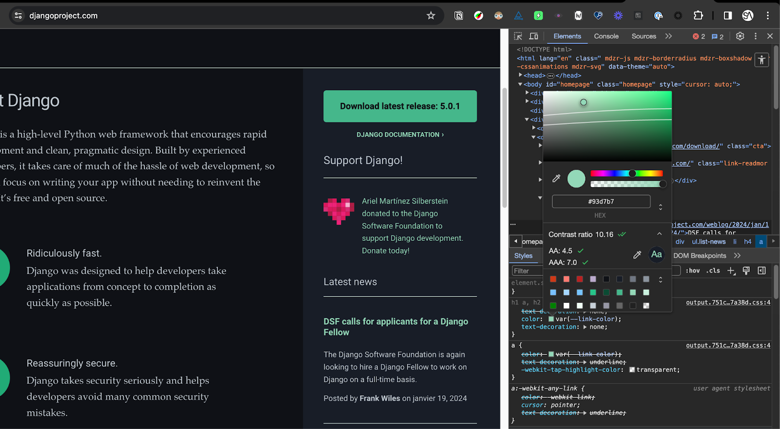
Color contrast of a text in the sidebar with chrome devtools on djangoproject.com
You can have an extension that you can add to your browser to also check colors and contrast. For example, I personally use colorblindly for Chrome to see the difference between colors visions that could exist.
Finally, you have dedicated websites or tools that will help you to check contrast only for specific things. I really like whocanuse.com about different types of vision between a color and the background color associated.
If you want to compare two colors with a matrix, contrast-grid from eightshapes.com is my go to.
There are specific tools that help you to adapt the color in function of the image for example. You can see that in social media, for example in Instagram, the text over a background will be white or black in function of the color, to make sure it has the correct contrast.
ARIA attributes
ARIA is the abbreviation of Accessible Rich Internet Applications. This is useful to provide accessible information in addition to the HTML semantic, but this should be used only when it’s necessary.
For example, something that should be used for showing the current element: page, section... A good example is the breadcrumbs:
<nav aria-label="breadcrumbs">
   <ol>
      <li>
         <a href="/">Home</a>
      </li>
      <li>
         <a href="/blog">Blog</a>
      </li>
      <li>
         <a
            href="/blog/accessibility"
            aria-current="page"
         >
            Accessibility
         </a>
      </li>
   </ol>
</nav>
The risk with ARIA is that people think each time it’s needed to add an attribute and it’s not the case. HTML semantics can be sufficient in some cases. For example, a tag button doesn’t need to have a role, it automatically has a role button. You can find more information on ARIA roles on the MDN website.
Landmarks
Landmarks are the “sections” that structure the website: header, main, footer, nav…
This can be defined via the HTML tags, main have its own tag and this allows to define the main content of the page.
Landmarks are especially useful to structure the page but also to move from a section to another easily with screen readers.
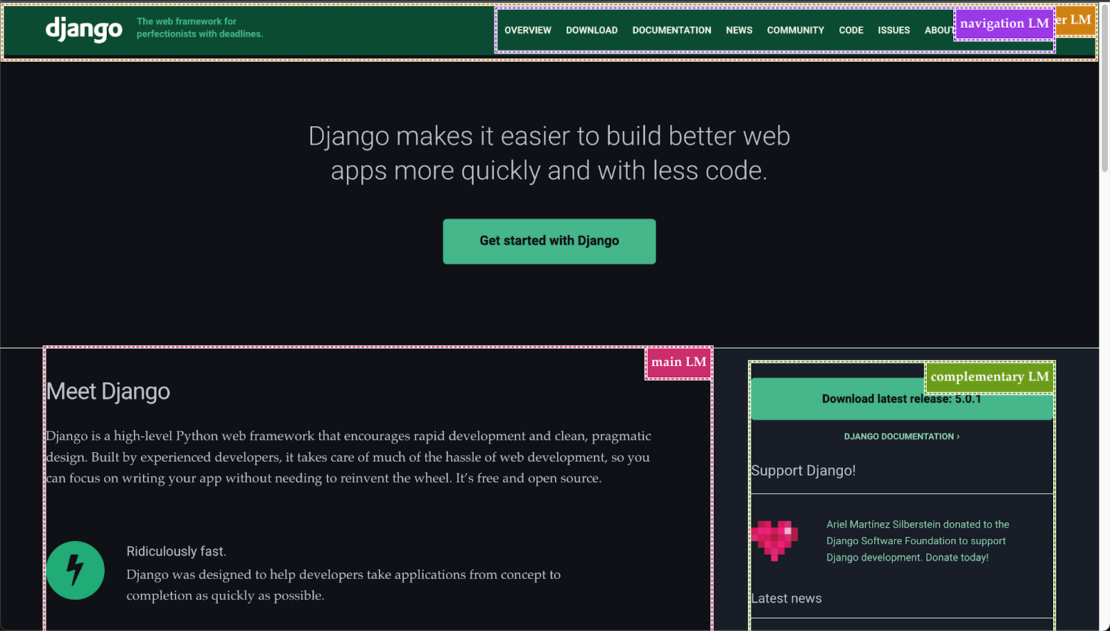
Landmarks displayed with squares on djangoproject.com with Accessibility Insights*
One thing to not forget is for a given type of landmark is used multiple times, for example <nav> for the navigation landmark, then each occurrence needs a aria-label to tell them apart.
Screen readers
Screen readers are very useful for people who have disabilities or prefer to use them to make their life easier. Many would think it’s only for blind people but it’s not the case. Someone with dyslexia can use a screen reader when using a computer or someone who has motricity issues, even temporary for example. Screen reader will announce the content of a website via text-to-speech or on a braille display. They also propose multiple ways to interact with the website with a keyboard, it's not only reading content: fill a form, interact with the browser and so on.
There are different screen readers in function of the device or browser supported and functionalities. JAWS and NVDA are the most popular. VoiceOver is the one by default on Apple devices. Microsoft operating systems use Microsoft Narrator. Android based devices provide Talkback screen reader or VoiceView by default. For Linux and Unix systems you have Orca or SpeakUp. You should be able to have a screen reader for your device.
You just need to try to put yourself in someone else’s shoes who can’t perfectly see the website and walk through the website with the tool.
Conclusion
To summarize, this accessibility review checklist is a good way to introduce people to accessibility and review your own sites to correct errors that might force people not to use your site. This one is my own checklist but there are many nice checklists, you can give a look at the list below.
Special thanks to the reviewers of this article, who should recognize themselves. Thank you for your support 💚
-- May the future be accessible with those checklists ⭐